Wednesday, May 12, 2010

Economy Improves In April

**Notice: Links to original BEA and BLS reports change periodically as monthly statements are released. As such, they may not link to the original statistics cited. However, you can use the historical data links on both sites to view previously cited figures.

The two most watched economic indicators were released a few weeks ago. One was the change in GDP from the preceding quarter reported by the BEA , the second was the employment summary released by the BLS.

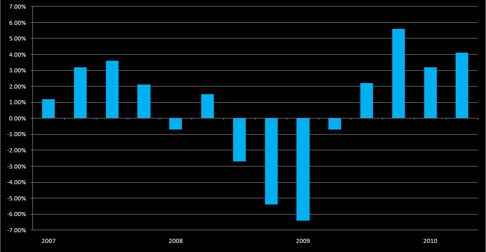
First I will begin with the BEA report [link]. It states that the economy grew by an annualized rate of 3.2% in the first quarter of 2010, or the period from January to March. This is in contrast to the 5.6% growth in the final quarter of 2010 from October to December. The increase comes from consumption expenditures and private investment. Negative figures were posted for imports and a decrease in government spending, which in total took roughly 1% off of the GDP figure. One particularly concerning fact is investment in residential homes shrank, further evidence of a turbulent housing market nearly 1 and a half years after the initial pop of the housing bubble.

Below is a chart showing growth in RGDP since the first quarter of 2007. The last bar is a projection, and is not an official BEA figure.


While economic growth continues, change in the unemployment rate seems to be lagging. After 9 months of continuous growth, the unemployment rate continued to climb into the double digit range, peaking at 10.1% in October of 2009. For the first three months of 2010, the unemployment rate remained at 9.7%. In April, the rate increased again to 9.9%. The Bureau of Labor Statistics report is located here [link].

The chart below shows the change in the unemployment rate since January of 2007;


The BLS reports that discouraged workers once became optimistic, and restarted their job search, which pushed the unemployment rate up.

The second measure we have to use is net job gains. For March and April there were sharp gains in the net jobs figure, although the unemployment rate did not go down. The numbers for the net change in payroll employment are included in the previous link. Both March and April posted gains of over 200,000 jobs for 520,000 jobs added in the past two months. Around 150,000 of these jobs were related to the 2010 Census.

Below is a chart showing net payroll change since 2007;


This image in particular conveys just how painful the recession was on the job market. In fact, since the recession began nearly 9 million jobs have been lost. And while figures from the last two months are promising, the road to recovery is going to be a long and painful one for many Americans...

Monday, May 10, 2010

Red State Socialism?

One could not have caroused the internet to satisfy their desire for politics without coming across the concept of red and blue states. It is a well known concept that red represented the Republican party, while blue represented that of the Democrats. Such was not always the case, after Reagan's landslide re-election, the results were dubbed a "sea of blue". Reagan was no Democrat, but at the time blue represented the incumbent party, while red represented the aggressor party.

This all changed in 2000. With the hotly contested battle for the White House raging on following election day, the map of red and blue states was constantly plastered on our television screens, or in many cases our AOL homepage (heh). As the weeks dragged on, seeing Bush and the Republicans with red states and Gore and the Democrats with blue states established what would become a permanent fixture of American politics; the red state/blue state divide.

The concept is simple, we classify states for political purposes based only on what party they vote for in presidential elections.

Some time ago, a particular graphic appeared all over the internet, and has become a staple of many red state vs. blue state confrontations;


After some research, I traced the origin of the chart to the Democratic Action Team.

The chart basically shows the difference between federal fund allocation to each state, as well as the federal tax revenue generated by each state. The data is from 2005, years before the economy collapsed.

The U.S. Census Bureau prepares a Consolidated Federal Funds Report every year, which outlines total federal expenditure by state. Data since 1993 is available for viewing online [link]. The IRS records tax revenue by state, with data viewable here [link]. The latest complete figures are available for 2008. The Census will release 2009 data on spending in June.

For extra fun, I put together my own chart using Excel, which is updated for 2008 and includes the swing states for the 2008 election;


As you can see, there is quite a change in only 3 years. Part of it pertains to the recession in the later part of 2008, which required significant emergency spending by the federal government, and a drop in revenues throughout the states. Utah appears to have the most balanced spending ratio, receiving exactly $1.00 for every $1.00 in taxes. 8 other states also have decent ratios, when considering the range of within 10¢ of $1.00 as ideal.